Forge3D
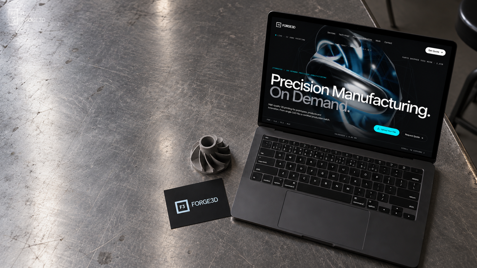
Forge3D runs an on-demand precision manufacturing operation — FDM, SLA, SLS and MJF printing turning CAD files into shipped parts. Their quoting process was still stuck in email: a design engineer would attach a file, wait days for a human quote, and hope the tolerance came back right. We built the platform that lets them upload a file and get a certified, production-ready quote before they've finished their coffee.
Forge3D had the manufacturing capacity and the precision to compete with anyone. What they didn't have was a front door — a way for engineers to self-serve a quote without a phone call and a two-day wait.
How we built it
Quoting Engine
Designed the instant-quote flow — drag a CAD file in, get pricing across FDM, SLA, SLS and MJF with tolerance down to ±0.05mm, in seconds.
Upload & File UX
Built a drag-and-drop uploader with live mesh preview, automatic orientation checks, and inline flags for non-manufacturable geometry.
Live Job Tracking
Shipped a real-time dashboard — job status, printer queue position, and shipping ETA, so 'where's my part' never needs a phone call again.
Platform Rollout
Phased launch across FDM first, then SLA/SLS/MJF as capacity onboarded. Every release measured against quote-to-order conversion.


The numbersdon't lie
We used to lose engineers to slower competitors just because our quote took two days. Now the quote is faster than the phone call would have been. Monument built us the front door our manufacturing capability deserved.